
An onboarding UX/UI Guide for clients for an internal banker/teller, and consumer admin products. Using an example made for client of client: Everbank (formally TIAA). Password to figma files is: Kagy

During my collaboration with the client, it became evident that the existing onboarding process for the product was inadequate and frustrating for clients. Many struggled to effectively integrate their branding into our product, leading to inconsistencies and dissatisfaction. Clients often relied on poorly designed solutions, such as hastily created PDFs that failed to accurately represent their branding needs. Others submitted Excel sheets with CSS specifications, but these frequently resulted in extensive revisions because the final output rarely matched their expectations. This disjointed approach not only hindered the onboarding experience but also created additional work for both clients and our team, underscoring the urgent need for a streamlined, user-friendly onboarding solution.
Create a simple, accurate, and efficient onboarding process for clients utilizing Consumer Studio, facilitating a seamless introduction to the product. We aimed to create a comprehensive framework that not only implemented clients’ branding effectively but also ensured that their specific needs and preferences were met. By establishing a clear and consistent reference point—termed “true north”—we sought to provide client project teams with a reliable guide throughout the development process.

To get to where we wanted, we had to analyze what we had before. This meant dissecting what worked and didn't work on the previous process for onboarding. We wanted to break things down into Communication Processes, Branding, Custom Work, and Scope.
The process before used an 8 page PDF that basically asked asked for two colors: A primary color and a secondary color. Outside of that there wasn't anything else to showcase the brand within the product.
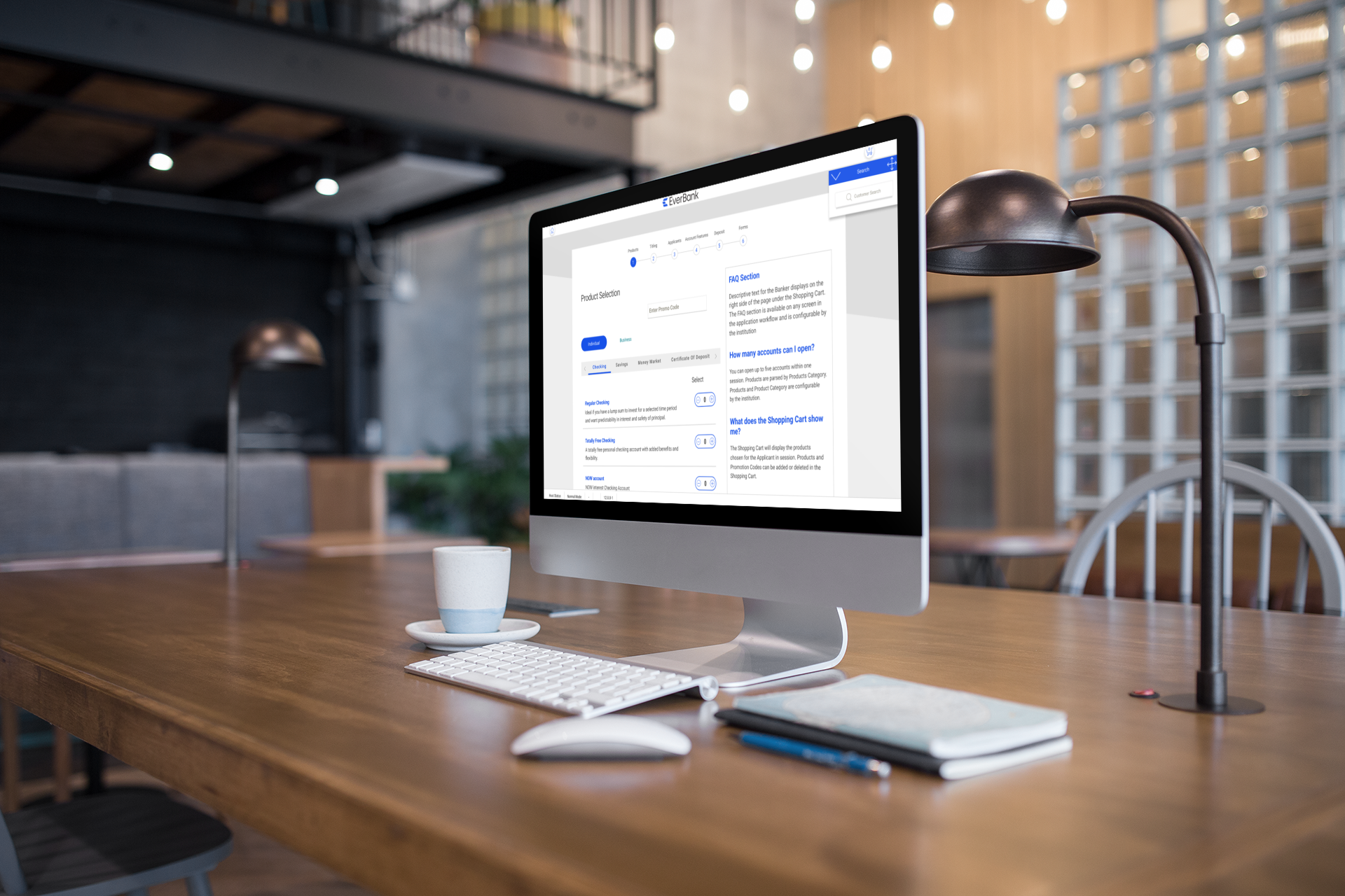
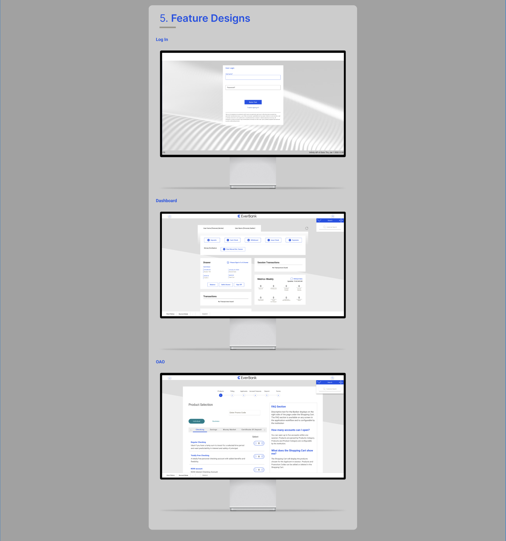
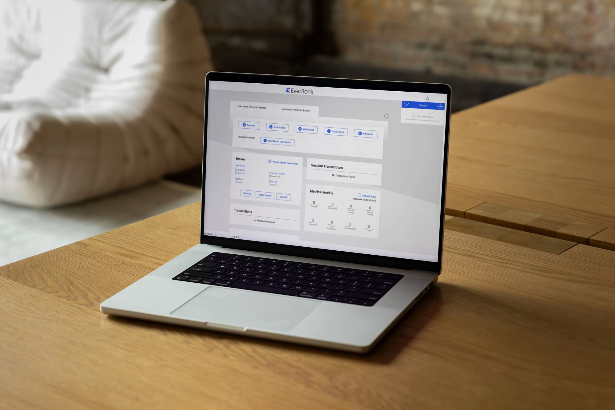
The onboarding process was designed to be fully interactive and dynamic, allowing clients to see real-time updates as they made changes. As clients adjusted their branding elements during onboarding, all preview screens updated instantly, providing a clear visualization of how their selections would appear throughout the product. This system not only offered a tangible representation of their brand integration but also served as a comprehensive guide for the entire platform, which includes over 144 features and states. By creating this living style guide, we empowered clients to make informed decisions and ensured consistency across all facets of the product, ultimately enhancing their overall experience and satisfaction.
In our onboarding guide, we focused on the most frequently used features of the banking software: Login, Dashboard, and Online Account Opening. By showcasing these essential screens, clients could easily visualize how their branding adaptations would appear in the context of the product. This targeted approach not only demonstrated the immediate impact of branding changes but also ensured that clients were equipped with practical examples to reference throughout the onboarding process. By providing clear visualizations of these key user interactions, we aimed to facilitate a smooth and effective transition for clients, helping them integrate their brand seamlessly while ensuring a consistent user experience across the platform.
1) Embracing Simplicity
We learned that "simplicity is the ultimate form of sophistication." Initially, there were several instances where we overwhelmed our designs, leading to confusion and inefficiencies in communication. To rectify this, I adopted a guiding question for the team: "Is this the simplest way to showcase, explain, or demonstrate this?" This mantra became instrumental in filtering our decisions and ensuring that our approach remained clear and focused.
2) Valuing Feedback, Research, and Testing
Our preconceived notions about design ideas weren't always aligned with user needs. We recognized the critical importance of testing concepts with clients and soliciting their feedback. Unfortunately, we engaged UX research too late in the project due to timing constraints, as we didn’t have access until after the project kickoff. However, once we integrated data and user insights into our decision-making process, it significantly enhanced our design outcomes, steering us away from biases and towards evidence-based solutions.
3) Setting the Tone with Client Guides
When implementing these guides in client projects, which significantly influenced the collaborative dynamic. The implementation team observed that presenting this guide helped clients comprehend our methodologies and recommendations. By showcasing ideas in real time, we fostered a more engaging partnership, encouraging a deeper understanding and more meaningful collaboration.
This project reinforced the value of simplicity, the necessity of incorporating research and feedback early in the design process, and the effectiveness of structured communication with clients. By prioritizing these principles, we enhanced our user experience outcomes and strengthened our client relationships.
.png)
