
Led product design for a white-label banking platform that launched across 10+ enterprise financial institutions, achieving 40-80% user adoption within 6 months, 31% increase in digital engagement, and a 19% reduction in support tickets.
.png)
FIS Global's D1 platform had become a liability in an increasingly competitive digital banking landscape. While the legacy product remained functional, it was built on outdated infrastructure that couldn't support the flexibility modern banks demanded. Large financial institutions were requesting third-party integrations like Plaid, deeper customization options, and mobile-first experiences—capabilities D1's architecture simply couldn't deliver.
User testing consistently revealed the consequences: confusion and high cognitive load caused users to abandon tasks mid-journey, particularly when managing their accounts. Banks were stuck with a platform that worked but didn't innovate..
The Stakes:
The primary challenge was building a scalable white-label foundation that could serve 10+ enterprise banks without creating unsustainable customization debt. We needed a core product optimized with variables and tokens that could be efficiently rebranded while maintaining consistency across all implementations.
Equally complex was balancing innovation with familiarity—breaking away from D1's patterns while ensuring the product didn't feel foreign to transitioning users. We were also building both the product and its design system simultaneously from scratch, with no existing foundation to reference.
Constraints:
The design process began with comprehensive discovery—user interviews, D1 usability testing, analytics reviews, and competitive analysis to understand both the problems users faced and the opportunities the market presented. This research informed a philosophy grounded in Atomic Design methodology, ensuring every component and pattern could scale efficiently across the white-label platform.
From the start, scalability was baked into the design system. Every component was built with variables and tokens, allowing the team to rebrand for new banks by simply swapping values rather than redesigning elements. This approach transformed what could have been a customization nightmare into a streamlined onboarding process for each financial institution.
The team operated in a SCRUM environment with daily standups, regular design audits, and continuous feedback loops. Collaboration between the two senior designers, product managers, and engineering was tight, with decisions driven by data rather than opinion. When faced with the tension between innovation and familiarity, we let usability testing, A/B tests, and analytics guide the direction—ensuring changes were validated before implementation.
Features progressed through user flows, prototyping, and iterative refinement, with validation coming from multiple sources: usability testing with end users, pilot launches with partner banks, and design audits from client stakeholders. This multi-layered validation ensured the product met both user needs and business requirements before full-scale launch.
The final product centered on clarity, context, and data-driven design decisions. Rather than limiting features to what was easiest to engineer, the team prioritized what users actually needed—a shift that fundamentally changed how the product was built.
Dashboard
.png)
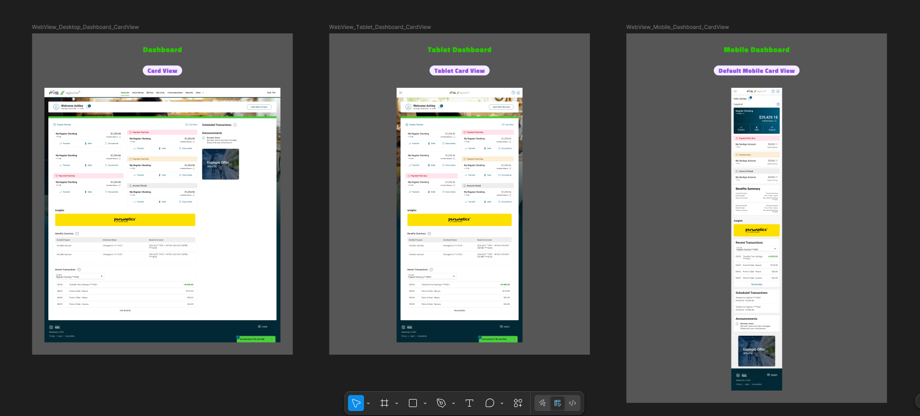
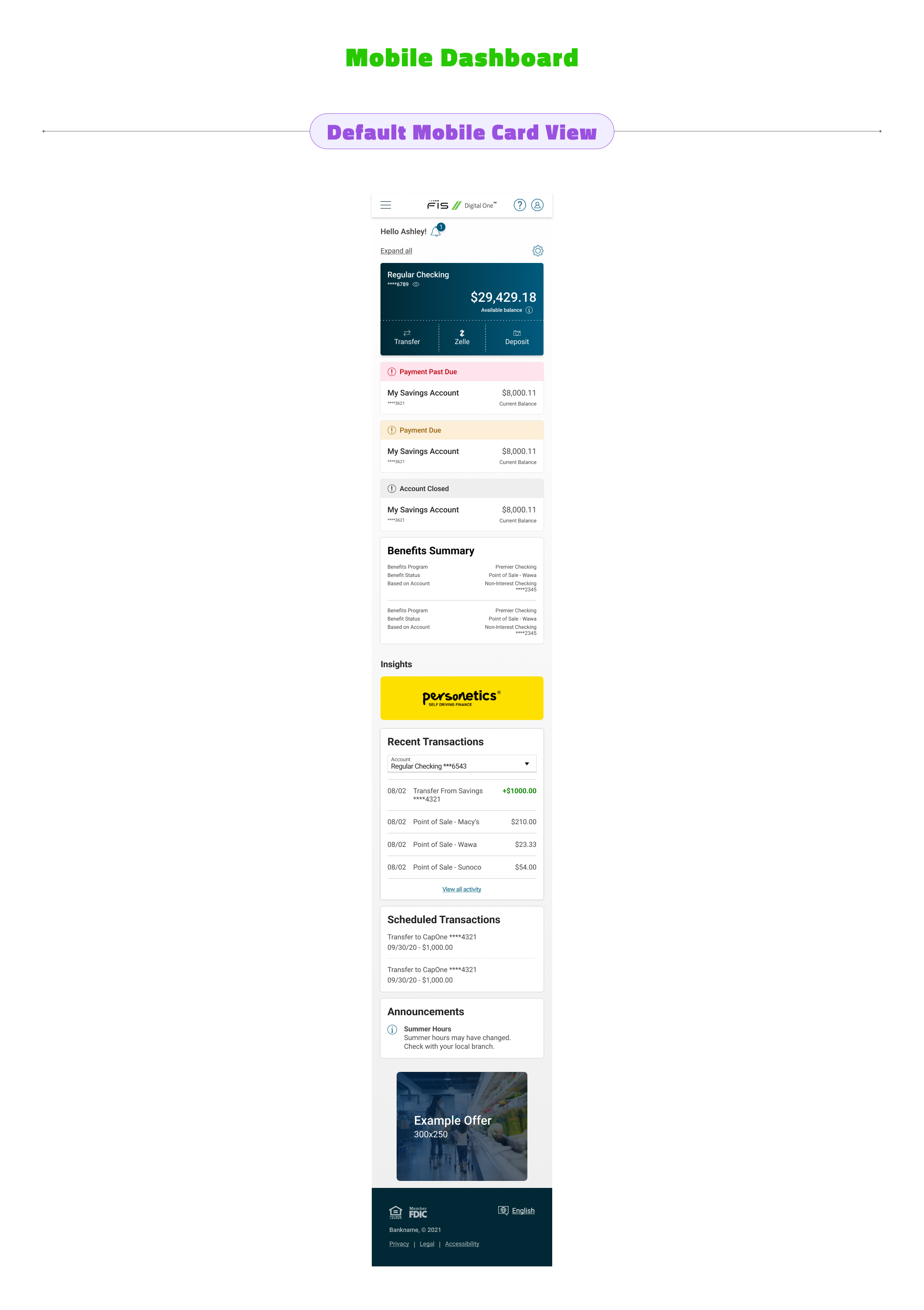
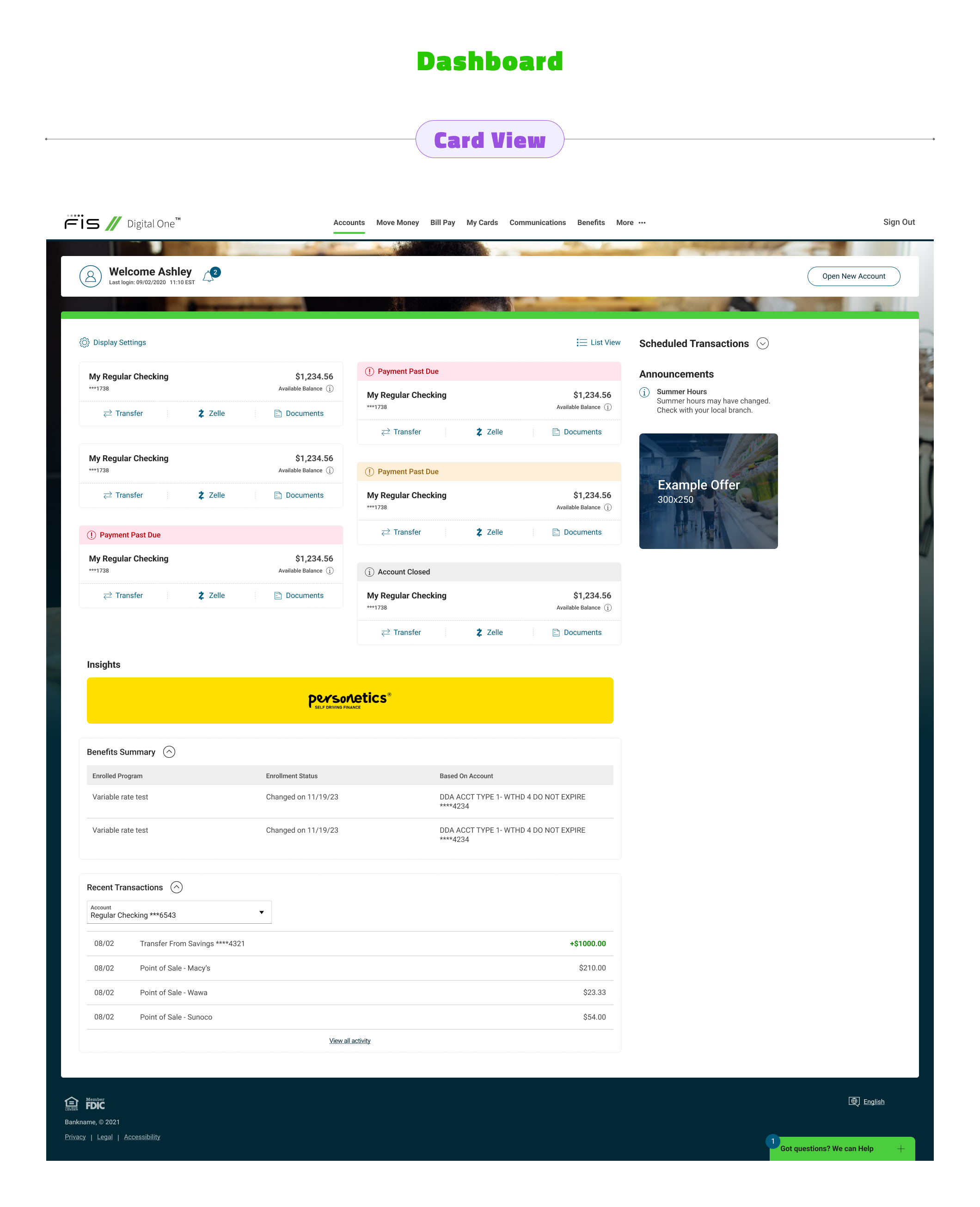
The dashboard became a central dropzone providing an at-a-glance overview of everything users needed: accounts, balances, payments, insights, benefits, and scheduled transactions. The design deliberately decluttered the interface, removing unnecessary elements and focusing on the information users accessed most frequently.
Accounts Management
Interactive Figma prototype - zoom and explore the flow.
For Accounts, the approach was intentionally straightforward—building intuitive workflows for drill-downs, transactions, and transfers without reinventing familiar banking patterns. The goal was simplicity and ease of navigation, letting users accomplish tasks without cognitive friction.
Enrollment
Interactive Figma prototype - zoom and explore the flow.
The enrollment journey was redesigned as a clear, linear walkthrough that guided users through signing up for online banking without confusion or unnecessary steps. Each stage of the process was streamlined to reduce drop-off and build confidence.
Remote Deposit Capture
Interactive Figma prototype - zoom and explore the flow.
RDC required close collaboration with developers to ensure the flow was both technically feasible and user-friendly. The result was a straightforward process that did exactly what users needed without overcomplicating the experience.
What Shipped:
Impact:

Client feedback validated the 18-month investment in rebuilding from the ground up—the product was praised as a major improvement over D1. While Remote Deposit Capture required additional iteration to meet user needs, the overall reception was overwhelmingly positive. The success demonstrated that leading with data-driven design rather than engineering convenience produces measurably better outcomes for users, clients, and the business.
.png)
