
Built a design system that reduced defects by 27%, cut design-to-dev handoff time by 30%, and saved $200k annually across Consumer Studio's banking clients.
.png)
Consumer Studio had no single source of truth. Design files were scattered across multiple designers' computers in Adobe XD, with no consistency in how components were built or documented.
Some elements were standardized. Most were not. Every designer had their own version of "the button" or "the input field," and developers were left interpreting which version was correct.
The Stakes:
This wasn't just "build some components in Figma." We had to solve several problems simultaneously.
Constraints:
I approached this in three phases:
Phase 1: Audit & Foundation
Phase 2: Build & Document
Phase 3: Rollout & Adoption
I designed a comprehensive design system with three core layers:
1. Component Library (2,300+ Components)
.png)
Built a library covering every Consumer Studio pattern - from basic atoms (buttons, inputs) to complex organisms (data tables, dashboards, workflows).
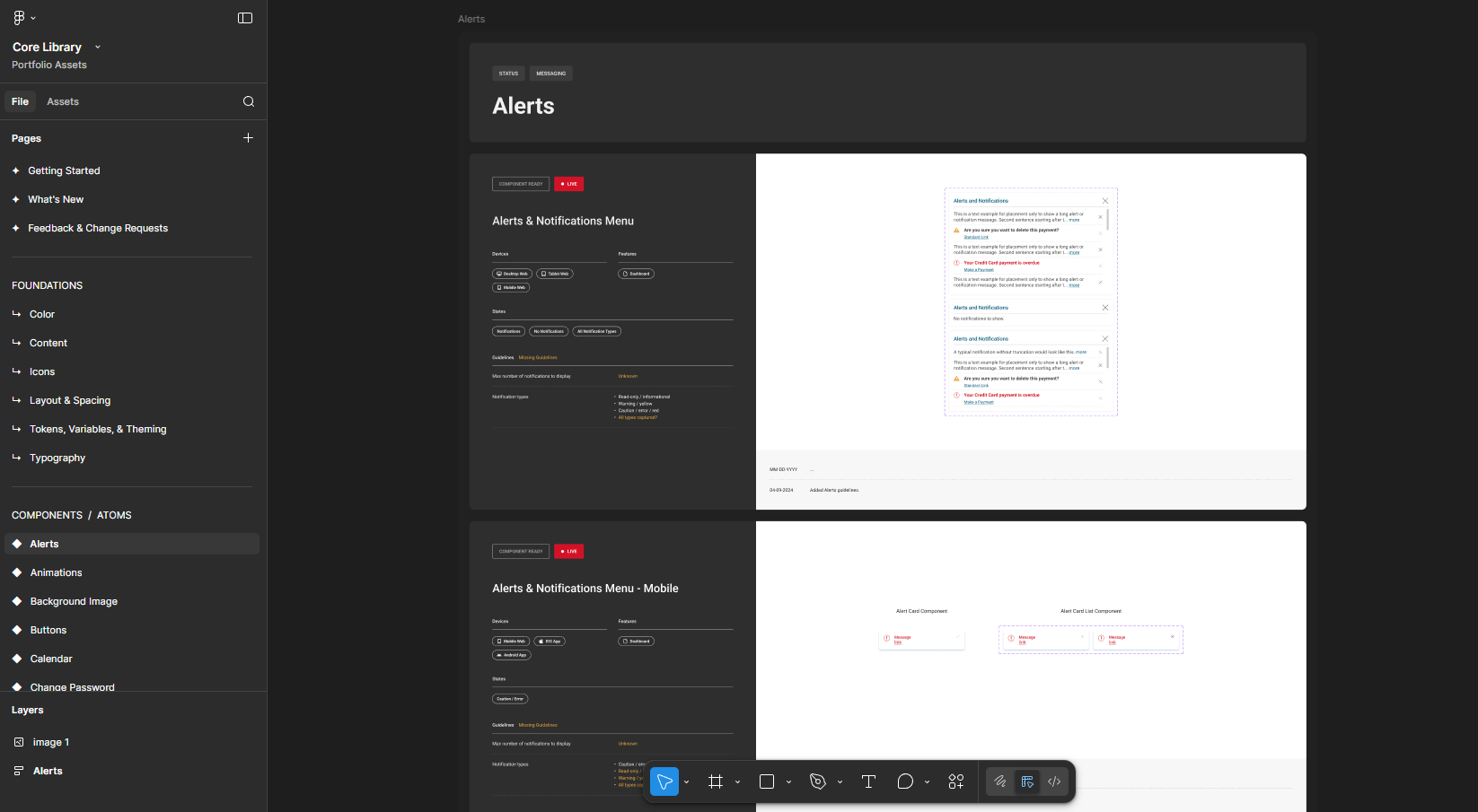
Each component was documented with all interaction states, usage guidelines,and developer specs.
Key Decision: Started with foundational components (buttons, inputs, typography) before building complex patterns. This allowed us to compose larger components from proven building blocks, ensuring consistency across the entire system.
2. Design Tokens & Rebrandability
.gif)

Established a token system for colors, typography, and spacing that could be customized per banking client. This allowed Consumer Studio to serve multiple large financial institutions with different brand requirements without rebuilding components.
Key Decision: Used Figma variables to make the system rebrandable at scale. Banking clients could swap color palettes and typography while maintaining functional consistency across all components.
3. Documentation & Guidelines
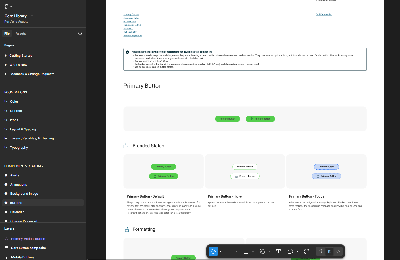
Documented every component with usage guidelines, interaction states, accessibility requirements, and developer handoff specs. This eliminated the hours of back-and-forth communication that previously plagued design-to-dev handoffs.
Key Decision: Documented components for both designers AND developers. Each component included Figma specs (spacing, typography, colors) plus implementation notes (HTML structure, CSS classes, accessibility attributes) to ensure accurate translation from design to code.
What Shipped:
Impact:

The biggest challenge wasn't building the components - it was getting teams to adopt them. Moving from Adobe XD to Figma felt like "extra work" upfront, even though it would save time long-term. I learned that mandating adoption without explaining the "why" creates resistance.
If I could do it again, I'd involve developers earlier in the component build process. We built the Figma library first, then handed specs to dev, which created some misalignment on technical feasibility (especially around complex data table states). Co-designing with dev from day one would have caught these issues before they became rework.
The system's success ultimately came down to documentation. Teams didn't adopt the system because it was beautiful - they adopted it because it made their jobs easier. Clear usage guidelines and detailed specs turned the design system from "nice to have" into "can't work without it."
.png)
