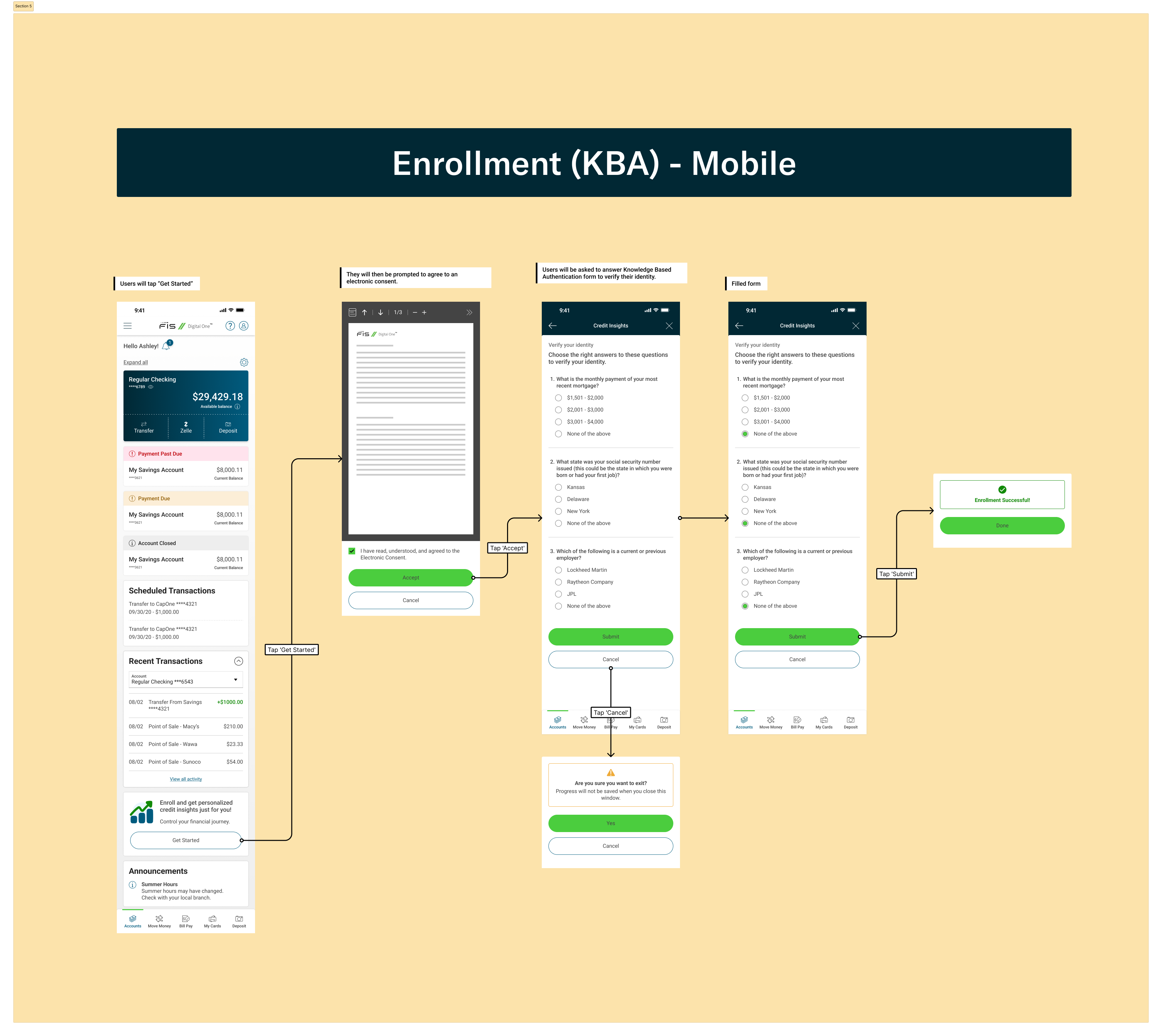
Redesigned credit insights enrollment for Chase, Chime, EverBank, BMO Harris, and Jenius Bank; reducing the flow from 13 screens to 5, keeping users in-product, and increasing engagement by 11%.
.png)
Personetics didn't have a native credit insights product within Consumer Studio. Instead, users were redirected to third-party tools where they had to manually re-enter their financial data—creating friction, drop-off, and a disjointed experience.
At the same time, demand for accessible financial education and credit visualization was growing. Banks using Consumer Studio needed a way to keep users engaged within their platform while delivering real value around credit health.
The Stakes:
This wasn't a typical design project. There was no PRD, no Jira tickets, no structured requirements. We started with a rough prototype from Array and had to build the plane while flying it.
Constraints:
.png)
I worked directly with Array and Personetics to confirm the technical approach—using iframes and API calls to pull credit data into Consumer Studio in real time. From there I focused on two core problems:
1. The enrollment flow was losing people halfway through.
I streamlined the flow 13 screens that took you away from the banking page to 5 screens within our own product in an iframe, removing unnecessary steps and simplifying the messaging so users understood exactly what they were signing up for and felt secure in the product.
2. Credit data visualization was complex, often cluttered, and intimidating.
I designed a simplified visualization system that made credit scores, utilization, and payment history immediately understandable - even for users with limited financial literacy.
I designed three core components:
1. Enrollment Flow


Key Decision: Cut flow from 13 screens to 5 screens by removing redundant steps and consolidating information. This reduced cognitive load and made the value proposition immediately clear.
2. Credit Data Visualization
.png)
Key Decision: Used a modular widget system that could be customized per banking client while maintaining visual consistency with Consumer Studio's design system. This allowed us to scale across multiple brands without rebuilding components.
3. API-Powered iFrame Integration
.png)
Key Decision: Designed the iFrame layout to feel native to Consumer Studio, not like an embedded third-party tool. This maintained trust and reduced perceived friction.
What Shipped:
Impact:
If I could do it again, I'd push for structured user testing before we locked in the iframe approach. While the technical integration worked, we didn't validate whether users preferred in-product enrollment vs. third-party handoff until after we'd committed to the architecture. Early testing would have given us more confidence in the trade-offs we were making.