
Built a design system that documented 3,100 defects across SummaCare's digital products, reduced customer service calls by 17%, and brought WCAG compliance to AA standard.
.png)
SummaCare's Plan Central product hadn't been meaningfully updated since it was built in 1997. For 27 years, it had been maintained by ASP.NET developers with no design support—functionality worked, but the user experience was a disaster.
The product was developer-led with no design system, no consistency, and no accessibility standards. Buttons looked different on every page. Colors and spacing were inconsistent. Basic interactions like tabs and buttons didn't work properly. It took 11 screens just to view your claims—on a product designed primarily for viewing claims.
The Stakes:
This wasn't just building a design system—it was modernizing a 27-year-old healthcare product used by the largest hospital system in the Akron area (4 hospital sites, hundreds of private practice offices) while working with a development team that had been maintaining legacy code since 1997.
Constraints:
I approached this in a few phases:
Phase 1: Audit and Documentation
Phase 2: Build & Accessibility
Phase 3: Rollout & Adoption
I designed a comprehensive design system with three core layers.
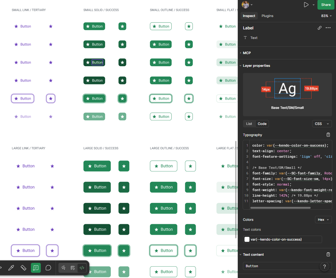
1. Component Library (1,100+ Components)
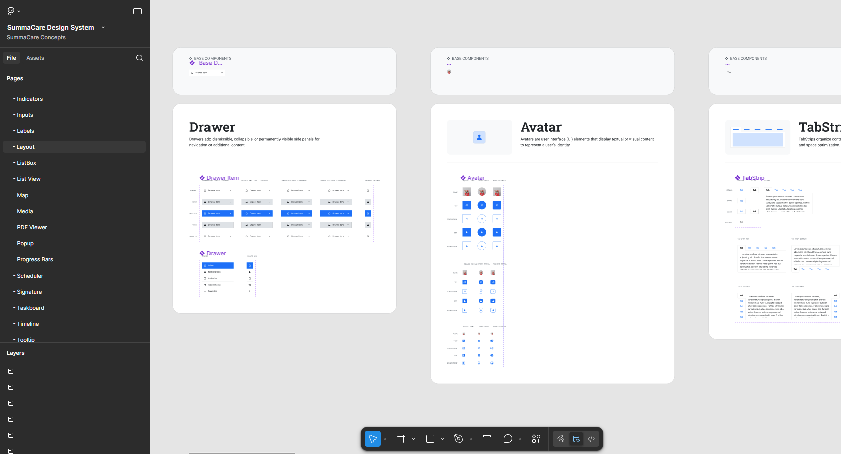
Built a library covering every SummaCare pattern—from basic buttons and inputs to complex healthcare-specific components like claims tables, member dashboards, and broker workflows. Each component was built with WCAG AA accessibility standards from the ground up.
Key Decision: Audited the existing 27-year-old product first to understand which patterns were most-used and where the biggest defects existed. This ensured the design system solved real problems, not just theoretical ones.
2. Accessibility & WCAG Compliance
Introduced WCAG standards to a team that had never tested for accessibility. Every component was built with proper color contrast, alt text, keyboard navigation, and screen reader support. Tested each component with actual screen readers to ensure compliance.
Key Decision: Made accessibility non-negotiable from day one. Rather than "fix it later," we built every component to WCAG AA standards and tested with screen readers before marking it as complete. This eliminated the need to retrofit accessibility later.
3. Documentation & Developer Handoff
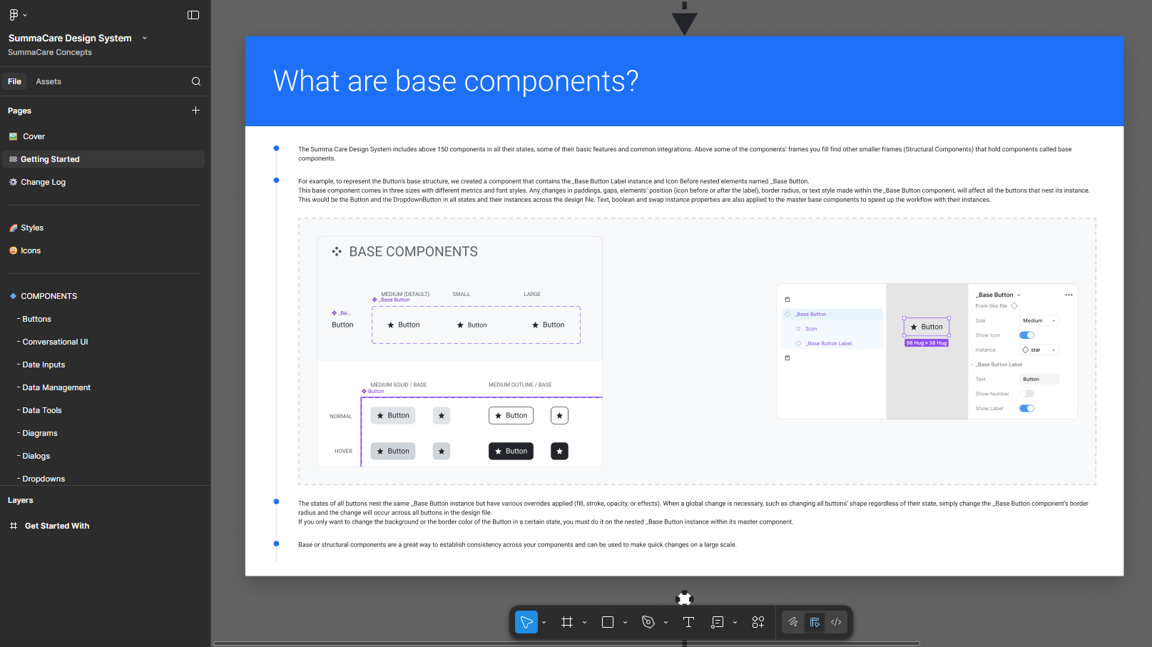
Documented every component with usage guidelines, interaction states, accessibility requirements, and ASP.NET implementation specs. This was critical for a development team that had been maintaining legacy code for years and needed clear guidance on how to implement modern design patterns.
Key Decision: Documented components specifically for developers unfamiliar with modern design practices. Each component included visual specs (spacing, colors, typography) plus detailed implementation notes (HTML structure, ARIA attributes, keyboard interactions) to bridge the gap between 1997-era ASP.NET and modern UI standards.
What Shipped:
Impact:

The biggest challenge wasn't building the components—it was introducing modern design and accessibility practices to a team that had been maintaining a 27-year-old codebase with zero design support.
I learned that you can't just hand developers a design system and expect adoption. I had to educate them on why accessibility mattered (not just compliance, but real users with real needs), how to test with screen readers, and what modern UI patterns looked like. The documentation became as important as the components themselves.
If I could do it again, I'd involve developers even earlier in the audit phase. They knew the ASP.NET codebase intimately and could have identified technical constraints sooner—like which components would be hardest to implement in legacy code. That knowledge would have helped me prioritize which components to build first.
The system's success came down to meeting the team where they were. Rather than forcing them to learn Figma or modern design tools, I documented everything in a way that translated directly to their ASP.NET workflow. That made adoption feel achievable, not overwhelming.
.png)
